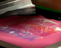
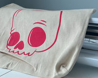
Mixing custom colors is a must for many printers, and creating those colors starts with the artwork. If the colors of your artwork don’t match the colors on press, you may have some unhappy clients. Golden Press Studio’s Art Director Cory Romeiser shows you how to turn any color into a Pantone color with Adobe® Illustrator in four simple steps.
WHAT ARE PANTONES?
Before you start to mix a color, it’s helpful to know a little bit about the colors you’ll be producing. Why do screen printers use Pantone colors? What even is Pantone?
In 1962, a company called Pantone created and standardized a color mixing system, called the Pantone Color Matching (PMS) System. The Pantone system uses a specific mixture of pigments to create spot colors, shown in the Pantone books. There are 1,867 colors in the Pantone Matching System, all made from variations of 13 base pigments.
Before that, every printer had their own color standards. If a customer wanted to get a specific color of yellow printed and then repeat it at another shop, there was no guarantee it would match. With the introduction of the Pantone System, you could just look it up and be right on target.
There are many systems of organizing color. Unfortunately, they don’t all match. If your client wants a specific Pantone color, but gives you artwork with colors in a different system (RGB, for example), you’ll need to convert it. Thankfully, there’s a simple solution.
RELATED: WHAT ARE PANTONE COLORS?
STEP 1: MAKE A COLOR PALETTE
Cory hops into Adobe® Illustrator and chooses a design with four colors: gold, purple-blue, light pink, and sage green. The design also contains black, but it doesn’t need to be changed to a Pantone color: black is universal. He clicks on the gold color. It currently has a hex code, because it’s an RGB color. For screen printing, it needs to be a Pantone color.
Cory hits “M” on his keyboard to draw a box. Holding “Shift” and “Option” at the same time, he drags the cursor to make a box. He then creates three more boxes by holding “Alt” and “Shift” and dragging the box to the right, creating another one. Using the eyedropper tool, he fills the boxes with the four colors he’ll be changing to Pantone colors.
These boxes are color palettes that will show the difference between RGB and Pantone colors. Cory highlights them and makes a copy to compare and contrast later.

STEP 2: CREATE A COLOR GROUP
Once the color palettes have been made, head to the right hand panel on the screen. Cory clicks on the “Swatches” panel.
Highlight the four boxes you created as a color palette. At the bottom of your “Swatch” panel, click “New Color Group.” This will generate a folder for you to organize your palettes. Cory doesn’t change anything about the prompt, and chooses to leave the title of this group “Color Group 1.” If you want to give your color group a name (“Jeremy,” for example), go for it. When you’re ready, hit “OK.”
The colors from the boxes you created now show up in the “Swatches” panel. The colors are organized, but they’re still not Pantones.
NEED A HAND WITH ADOBE® ILLUSTRATOR? TAKE OUR FREE CLASS
STEP 3: MAKE A PANTONE COLOR
Cory clicks on the folder to the left of the four colors in the “Swatches” tab. This highlights all the colors in the swatch. At the bottom of the tab, click the wheel in the middle of the bottom toolbar. This will allow you to edit the color group.
Clicking on the wheel brings up a menu called “Recolor Artwork.” From the menu, go to the page with the custom color wheel. Cory clicks on the grid shape in the menu, which reads “limits the color group to colors in a swatch library.” From that menu, click on “Color Books” and find the Pantone books.
There are two types of Pantone books: solid coated and solid uncoated. Coated books have a glossy finish, while Uncoated books have a matte finish. If you’re printing with plastisol, the Pantone Coated book is best for you. If you’re printing with water-based ink, you’ll want the Uncoated book. Since Cory’s design will be printed with water-based ink, he chooses the Pantone Solid Uncoated option from the menu.
RELATED: PRINTING WITH PLASTISOL VS. WATER BASED INK

Once you’ve selected either “coated” or “uncoated,” hit “OK.” Take a look at the Swatch tab. The newly-created Pantone colors are at the top, with the old RGB colors underneath. Hover over the Pantone colors at the top of the tab. They have a little dot in the bottom right corner that shows the PMS color you’ll need to print that exact shade.
In order to grab the PMS number from the color swatch, double click on the color. A window will pop up. The title of the window is the new Pantone color. Cory checks all of the colors in his palette: gold is Pantone 720U, the purple-blue color is Pantone 7667U, the light pink is Pantone 663U, and the green is Pantone 7768U.

RGB Colors (top) contrasted with Pantone Colors (bottom).
STEP 4: FINAL CHECKS
Compare and contrast the two color palettes. You might notice a little bit of a difference between the RGB colors and PMS colors. Now, head to your Pantone book. Compare the colors from Adobe® Illustrator with the colors in your book. Every Pantone book has an index in the back so you can find the color you’re looking for without sifting through hundreds of colors first. If you’re still happy with the shade, get to mixing! If you want a slightly different shade, don’t stress about it.
Let’s take a look at the gold color from Cory’s design. Now that it’s a Pantone color, it’s code is PMS 720U. Look the color up in your Pantone book. If you want that color to be a little bit darker or lighter, simply use the color swatch below or above PMS 720U. The great thing about these books is that they are comprehensive, repeatable, and can help you adjust your colors so everything is exactly the way you want it. All you need to do is head to your mixing system, mix the colors, and get printing.
RELATED: UNLOCK ANY COLOR WITH THE FN™ PLASTISOL INK MIXING SYSTEM

The gold color shifted slightly from an RGB Color to a Pantone Color.
There you have it: it’s just that easy. Turning colors into Pantone colors is a super simple process that will streamline your shop process. You can match any color with the Pantone Matching System, and with these four easy steps, you’ll be printing custom colors in no time.