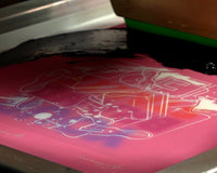
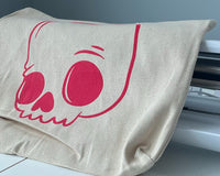
Vectorizing images is key to screen printing design. Adobe® Illustrator is an amazing tool to get everything ready to go for printing. By using tools in Adobe® Illustrator, you can vectorize images by using the “Image Trace” tool. Golden Press Studio’s Art Director Cody Romeiser shows you how to set up and use Image Trace to vectorize artwork.

If you receive a piece of artwork from a client or create one yourself using an illustration tool like Procreate, it’ll likely be in raster form. You’ll need to convert it from a raster file to a vector file in order to print those clean lines customers are looking for. In this free class on Adobe® Illustrator, Cory walks through the steps of making it happen.
RELATED: WHY PRINTERS NEED TO MASTER ADOBE ILLUSTRATOR FOR SCREEN PRINTING
SETTING UP IMAGE TRACE
To begin, open a new document. Before you use the “Image Trace” tool, you’ll need to make sure all your settings are suitable for the job. First, pull up your Image Trace menu. If you can’t find the icon on the right side toolbar, go up to “Window” and find “Image Trace.”
If you don’t have your art selected, you’ll notice that the menu is greyed out. You can’t use the menu until you bring in some artwork. Cory goes to his desktop and grabs a design reading “Buy Local” from the Support Local Vector Pack.
Pro tip: If you’re following along with the Adobe® Illustrator class, you received several assets from this pack already. Simply locate the design Cory is using and follow along with the course.
Cory zooms in on the letters in the design. As he zooms in farther, the image becomes blurry, because it’s currently a raster image. Raster images are made up of pixels, and are not recommended for any sort of graphic design because you can not resize them without making the design blurry. File names of raster images include .psd, .pdf, .jpg, and .png, to name a few.
RELATED: THE DIFFERENCE BETWEEN RASTER AND VECTOR IMAGES
Once Cory has the image centered on the canvas, he makes a copy of it and drags it to the left side of the screen for reference. Then, he selects the image and clicks on the “Image Trace” panel again. He then clicks “Advanced” to pull up more settings to adjust the image trace to be as close to the original image as possible.
The “Image Trace” tool comes with a few presets you can use. If you’re feeling up to it, you can also make your own. Cory has created his own preset called “hand done.” The thresholds are at 97, paths and corners at 97%, and noise set at 1 pixel. Most importantly, “Ignore White” is selected.

WHAT DO THE SLIDERS DO?
The sliders are great and all, but what exactly do they change about the design? Cory touches on each to give you a better understanding of the nuances that these advanced features bring.
The threshold makes the lines thicker or thinner. By moving the sliders all the way to the left and then all the way to the right, you can see that the lines in the letters of the “Buy Local” design are changing. Cory sets it the thresholds to 97 so it mimics the original.
Paths make the corners of a design square. The lower the percentage is, the more square the corners of a design will look. Cory set’s these to 97% so the lines are smooth and not squared off at the corners.
Speaking of corners, the “Corners” slider sometimes affects the design. It makes the corners sharper. Because the corners in this design are already pretty sharp, it doesn’t do much. Cory sets the percentage to 97%.
Upping the noise in your design can fill in some areas of small detail. If you’re trying to get rid of some detail—if you don’t like the detail there, for example—moving the slider up will fill it in. Cory doesn’t want to fill in the spaces in the letters, so he sets his noise level to 1 pixel.
Finally, checking the “Ignore White” box will cause the white background of the original raster design to disappear. You’ll only have the black letters when you transfer the art to a vector image.
Once you’re happy with your preset, hit “Manage Preset” and “Save as New Preset.” You can name it whatever you’d like. Once you’ve named it, you’re all set.
USING IMAGE TRACE
The last step to using image trace is to expand the image. Right now, the design has a bounding box around it, because it’s still a raster image.
Completing this step is simple. Head to the top of Illustrator window and hit the “Expand” button. That’s it! Now it’s a vector image made up of anchor points. Cory compares the vector image to the original raster image. The two look identical side by side.
Now zoom in on the two images. The raster image quickly becomes pixelated as you zoom farther and farther. The vector image, on the other hand, can be zoomed in as much as you want. The lines will never look blurry or pixelated, because the design is made up of anchor points instead of pixels.

Vector images stay crisp no matter how far you zoom in.
There’s one more step in the process. Currently, the entire design is a group. This means you can’t move individual elements of the design around. If you want to be able to remove elements from the design and drag them around the canvas by themselves, you can simply ungroup the image.
To do this, right click and hit “Ungroup.” To re-group the image, simply hit “Command G.”
RELATED: HOW TO CUSTOMIZE A DESIGN FROM A VECTOR PACK IN ADOBE ILLUSTRATOR

Image trace works really well to imitate the original art. You can turn any design into a vectored image with just a few clicks, and get to printing.