Mixing ink is an art form. Sometimes you’ll mix your Pantone ink just right, following the formula, but when you go to print, the Pantone color looks totally wrong. No matter how perfectly the formula is crafted and how flawless your process is, there are some variables that you have to account for yourself when mixing Pantone inks. Let’s go over a few of these variables and see how they influence your Pantone colors.

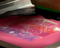
Photo by Josh Dykstra
LIGHT QUALITY AND SOURCE
When you mix Pantone colors in a dark space, you might notice they look different than the card you’re trying to match them to. The light you’re looking at the color under affects how you see it. Whether you mix your ink in a brightly lit area of the shop or in a dark cupboard under the stairs, make sure to do your final color check in a bright space.
You can “test” your lighting to gauge its ability to display color accuracy. In the back of the Pantone book, there’s a page that shows the quality of your light source. If your lighting isn’t in the D50 range, some colors may look drastically different.
RELATED: WHAT ARE PANTONE COLORS?
SCALE ACCURACY
Scale accuracy is most important when mixing a small amount of ink at a time. If you’re mixing less than 300 grams of ink, you’ll want a scale that reads to 0.01 decimals. This will ensure that you get the precise amount of each mixing color that you’ll need. If you’re mixing ink at 400-500 grams or more at a time, a scale reading to the 0.1 decimal will work great for you.
If you’re printing pastel shades, having a super accurate scale is also important. Since these colors can shift very easily, you’ll want a scale that can read to the 100th decimal place. Make sure to always zero out your scale every time you add new ink to the mix.
Most mixing softwares, including the FN-INK™ Mixing System, will display amounts to the hundredth of a gram. If your scale can measure that precisely, you’re good to go. If your scale does not measure out that far, you will have to round up or down. When rounding, you may see a color shift when mixing small amounts.
Pro tip: When mixing a Pantone color, start with the color that needs the largest amount of ink first. When adding small amounts of color, add the ink to the sides of the mixing container. That way, you can easily remove dollops of ink without taking out any other color.

TYPE OF INK
It’s important to note that all inks have a different level of opacity or coverage. Some inks, like magenta, are more translucent than others (like white). Many brands offer dedicated ink mixing systems. Once you get the mixing system, you can PMS match like a pro.
RELATED: UNLOCK ANY COLOR WITH THE FN-INK™ PLASTISOL INK MIXING SYSTEM
You can do everything right when mixing, but you still might notice a slight color difference on the shirt. There’s a reasonable explanation for this: color shift. Let’s talk about what color shift is, how it affects your inks, and how you can stop it from affecting your final prints.
COLOR SHIFT
Color shift in screen printing happens when the colors you see change based on the garment they’re printed on. Pantone (PMS) colors that are mixed to match the swatches in the Pantone® solid coated book are actually designed to be printed onto a white garment. This is because the book itself is printed onto white paper. When you print on white garments, you shouldn’t notice the colors changing from the screen to the shirt (although some inks like deep blue or navy can look darker in the bucket than on a shirt). However, when printing on colored garments it gets a little trickier.
There’s one way to make sure you notice a color shift before heading to production. Test your inks! Once you’ve mixed your PMS color, print and cure the ink on the shirt you will actually be using. This will tell you which direction to go to match the color visually, so you can tweak it to match the original color you/your customer wanted. If you’re printing on any color of garment except white, don’t expect the color to match.
The best way to mitigate this problem? Print an underbase. By printing a white base, you’ll be able to diminish any color shift that could happen when printing directly to the shirt.
APPLY THIS TO THE REAL WORLD
Always clarify with your customer how strict their color matching requirements are. For example, Volt Yellow from Nike must always look the same no matter what substrate it’s printed on in order to meet brand standards. Here are three easy steps to follow to make sure you’re giving the customer exactly what they are looking for.
STEP 1: FIND A PANTONE MATCH
Determine if your client actually wants an exact PMS match, or if a color that is close enough will be acceptable. “Close enough” will save you time and money, since mixing Pantone colors is a bit of a process and you may be able to sell the customer on a standard Ready-For-Use color instead.
If they have a specific PMS color in mind, it’s your job to do your diligence when mixing and tweaking the color so it’s spot on. If it’s not, you can advise the customer that you will mix the color as close as you can to the solid Pantone® book and show them what you have. It may be close enough.

STEP 2: CHOOSE GARMENT COLOR
Determine what color of the garments your customer wants. The color they choose will alter how you see the colors of ink printed on top. When mixing a specific PMS number, it is critical to consider the color of the garment which it will be printed on. You’ll always want to use a base white if you’re printing on colored garments, and understand that some color shift can occur.
STEP 3: GET CONFIRMATION
No matter what color of ink or garment you’re printing, getting confirmation from the customer is key. This part of the process should be standard in any job you do. Getting customer approval in writing protects your back, provides communication to the customer, and ensures that they’re happy with what you’re producing.
Show your customer the Pantone color they’re looking for. If they approve, print it on the garment you’ll be using for the job and show the test to the customer again. Make sure you have a signature of approval to cover all your bases before you start printing.
RELATED: TOP 3 CUSTOMER SCREEN PRINTING COMPLAINTS AND HOW TO HANDLE THEM

Pantone matching can take a little bit of time, especially if you’re using colored garments. Make sure to test your colors and get customer approval if you need it. Once you’ve played around with Pantones for a while, you’ll get more comfortable using them, and then you can unlock any color you can imagine.