Vintage prints have been a popular design choice for a long time. You can create a vintage print by taking a design and deliberately making that design look lighter on the garment so that the shirt color is influencing it but it also looks aged and worn. Want to learn how? Print expert Josh Wells walks you through the process.
WHAT IS A VINTAGE PRINT?
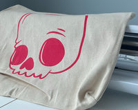
The purpose of a vintage print is to recreate what an older, aged print would look like. The print itself looks faded, well-worn. It has texture. The shirt appears through the print. The process of creating a vintage print isn’t complicated. You can do it with proper artwork and one screen.
Let’s walk through the process of designing a vintage print, setting it up for production, and printing for an old-school look on a brand new t-shirt.

DESIGNING ARTWORK
How do you make a brand new print look old? It’s easy: create an illusion. Make the print look like it has been washed out and worn over time.
A great way to achieve vintage prints is to distress or add texture to your design before you print it. In the video, Josh has added a gritty texture from the Gritty Texture Pack to create a vintage, distressed look before he even starts printing. By layering it on top of his design from the Outdoor Vector Pack, the print looks vintage although it’s brand new.
RELATED: PHOTOSHOP FOR SCREEN PRINTING: ADVANCED COLOR SEPARATIONS
PREPARING FOR PRODUCTION
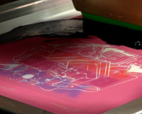
When you’re dealing with vintage prints, the shirt material will impact your final design’s look and feel. Regular cotton shirts will be rougher and create a print that is not as smooth. Ring spun or triblends will create a better visual and a softer feel.
The texture of the shirt will also influence the final print outcome. Heathered shirts will show a colored texture through the print, making it appear more vintage. Solid-color shirts also create a vintage look, but heathered shirts will show through the ink layer more. Josh uses two Allmade shirts: one solid black, one heathered blue.
You will also want to use a screen with a high mesh count. A screen with 230 mesh or higher will do the trick. It allows less ink to pass onto the shirt. The thinner the ink deposit is, the less opaque the print will be, further creating that vintage look.

INK CHOICES
For this print, Josh uses FN-INK™. If you want, you can add a curable reducer or a soft hand additive to make your ink thin and soft. Using an additive will show more of the shirt and possibly the shirt texture through the ink, creating that vintage look. It’s ideal to use additives to create a vintage print, but supply chain restrictions may make finding the additives difficult.
Printing without an underbase also will allow more shirt fibers to influence the print. You want the shirt to show through to achieve that weathered, washed out look.
If you are looking to conserve ink, a vintage print is the way to go. Vintage prints use a thinner layer of ink, so you won’t have to use as much. If you’re still running short, turning your full front design into a left chest or center chest design will save you ink as well.
Another way to achieve a vintage look is to print with water-based ink. Since water-based inks are less opaque than plastisol ink, it’s easier to create a vintage look. You won’t need to add anything to the ink to create a thin, soft blend. It’s already there. With plastisol, adding soft hand and curable reducers can mimic the look that water-based ink creates. However, using a soft ink like FN-INK™ will help you to create a vintage look without adding anything to the ink. Ultimately, the ink you choose for the job depends on what your customer is looking for.

BEST PRINTING PRACTICES
With every job, following best practices will get the best results. Here’s a few of Josh’s tips when printing vintage designs.
LAY DOWN A THIN INK DEPOSIT
Using a single print stroke will maximize the desired look and feel of a vintage print. It is recommended to pull when printing vintage prints. Pulling will give you more control over the amount of detail and ink you lay down. The more passes you do, the less worn out it will look. As you do multiple passes, the fibers are being matted down more and more, so the print becomes more vibrant.
Make sure you’re laying enough ink down, though. Even though vintage prints tend to look a little washed out, you can accidentally add more distressing to your print by not laying down enough ink onto the shirt.
If you’re using a curable reducer, a push stroke is best. The ink is so thin with the reducer added that it will run down your screen when you have it in the upright position, and will also lay way more ink down than you want.
CHOOSE THE RIGHT SQUEEGEE DUROMETER
Since you want to lay down a thin deposit, a 70/90/70 durometer squeegee—or even 80 durometer if you’re feeling risky—will be best. Harder squeegee durometers will lay down a thinner deposit. Remember that the harder the squeegee blade, the more fatigue your arms and hands will feel.
RELATED: HOW TO CHOOSE THE PROPER SQUEEGEE BLADE DUROMETER

Vintage prints are easy to print and are a great tool to add to your arsenal. The great thing about a vintage print is that if it’s not perfect, that’s just extra character. By creating vintage prints, you can keep clients happy and save on ink at the same time.