There are several options you can use to achieve the “distressed look”. Most commonly, printers use their design software to create distressed looking artwork. But before Adobe and the ease of digital design came around, screen printers would often distressed their actual positives. You can also use specific printing techniques to create that damaged, out of date appearance directly onto the garment. Depending on your desired method, here’s an outline of the actions you need to take to get the distressed look.
1. Scratching or beating positives with chains and other rough hard surfaces, like nails and pins. (This method is quite Neanderthal but it does provide a custom appearance.)
2. Creating distressed looking artwork directly in the art program. You can do this using filters, or textured brushes.
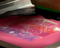
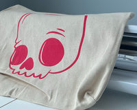
3. Printing a distressed and washed-out looking print directly onto the garment using special ink and printing techniques. You can use soft-hand additive or a curable reducer to thin down the color of your ink. When using these you’ll want to print though a much higher mesh count. Nothing lower than a 195 and no higher than a 250 mesh count. This coupled with a heavily reduced ink will create the appearance that the fabric has been dyed, versus just laying the ink on top. Use a hard squeegee (70 duro plus) to keep your print light, or for more saturation, you can use a softer squeegee. Either way, your last screen should be printed with hard squeegee to drive the colors further into the fabric.
These tips should give you the results you seek!